Data Disobedience Recently I attended a protest against the Bakken Pipeline, which is being built a few miles from where I live. About 30 people, including a couple of my friends, were arrested at the protest. Though I carried similar sentiments about the pipeline, I was only beginning to learn about the issue, and I wasn’t exactly committed to being arrested. And in learning about the issue, as with many things, I found it difficult that there wasn’t a clear map of where this is all going on. And of course there was no public mapping data available either, for a public easement that goes across four states.
A picture I took of my friend Julia Slocum getting arrested for blocking construction on the Bakken Pipeline in Boone County, Iowa.
A picture I took of my friend Julia Slocum getting arrested for blocking construction on the Bakken Pipeline in Boone County, Iowa.
Many people including myself have asked for mapping data of the Bakken Pipeline, and have been denied or given hard copy documents. In at least one case, Dakota Access LLC, the pipeline company, asked a state government to not release mapping data for their own security, even though you can see exactly where it is on the map images they give you, and can draw them out if you wanted to.
So I did – I asked each state, and found maps, and found some people (credited here) on upwork.com in the Phillippines and Kenya who spent several dozen hours taking them apart, spreading them over a map (called georeferencing), and drawing over it. So there is my act of civil disobedience, sort of. And here it is – a map of the Bakken Pipeline, that shows the precise location of the pipeline and allows you to locate your current position, shows the current construction progress, properties it crosses and taken by eminent domain, and the property owners in a lawsuit with Dakota. Soon there will be additional information like the location of camps and protests and events. The map is embedded below, but it is also available as a separate site that you can use on your smartphone, and also see where you’re located: https://bakkenpipelinemap.com/
A Data Call to Arms This is a part of a much larger problem – in the United States there are hundreds of thousands of miles of pipelines and power lines that are prevented from being mapped. This is deemed “critical infrastructure” that needs to be protected for security reasons. Usually this is misleading, and often it is bizarre. I once asked the Army Corps for a location of all the dams in the US, and they denied the request, even though you can see each of 90,000 dams in this country clearly on Google Maps, and can actually view them all on its website.
All 90,000 Dams are mapped and clearly seen but you cannot download them for “security” reasons.
The censorship of “secure” public data like this is like anything that becomes sort of moot with the internet, or can be if you took the effort. You can still generate a map if you take the effort to do so, and this would be a great effort to crowdsource. It’s as hard to understand energy without a map as it is to understand how to navigate without a road map. And speaking of security – it would be good for people to know the location of the 90,000 dams that choke nearly every river in this country, and the pipelines that are critical to water and soil everywhere, which is the most basic source of security there is. And centralization leads to more centralization and insecurity – if we cannot have a national map of our power grid, maybe the problem is that we need to have a more decentralized, resilient power grid, that is in the end more secure.
People should do this for all our censored public energy data – in the same way people have come together and mapped crises, it would be great if there was a collective effort to map all the pipelines and power lines across the US and the world. Like people in the humanitarian openstreetmap community came together to map Haiti after the earthquake, shown in the video below, groups should map pipelines as they are being proposed or constructed, and track their progress.
Watch how the people crowdsourced the earthquake mapping effort. The same can be done for our “secret” energy infrastructure.
Mapping Power through Energy In the long run, all of the world’s energy production and history should be mapped. It will explain a lot, from the history of why lines were drawn the way they were in the Middle East, to the geography of defense, power, corruption, poverty and the environment. Extractive industries almost as a rule corrupt places and make their power rest on single industries rather than the needs of people. There is hardly a single place where extraction industries like mining exist and the politics are not corrupt. This pipeline is no exception – it was driven through with all sort of political maneuvers on state utilities boards, using eminent domain across hundreds of farms for a private oil pipeline. The more this happens, the more each of these places will be corrupted, every county and state.
A fascinating map of oil in the Persian Gulf overlaid with the Shia majority areas. More data and more mashups make more meaning. Click to englarge.
Making Energy Come Alive MapStory.org is currently at the cusp of finishing a major overhaul, and this would be an excellent case of showing a current event unfolding. Digging through documents, it’s hard to know exactly where and when the pipeline was approved in each state, how it was constructed, and so on. Now with the weekly updated maps in Iowa, people will be able to track the progress of the construction, and going further back in history, as the map below shows of mining production in the Bakken Oil Fields. So far only two maps have been done, so not much to animate, but in the coming weeks, it will be tracked. In the long run, I see MapStory.org being location enabled like the one I made, and truly keep track of how things unfold. In the coming months I’ll be generating maps that make infrastructure come alive – imagine a map like the Toronto traffic map below, but of oil, showing where it’s going, exported, imported, and the oil fields being discovered, tapped, and shrunk over decades. That will allow people to see the history of resource extraction more clearly.
Flowing traffic in Toronto. The same can be applied to all the pipelines in the world, and see the direction it all flows.
The construction of oil wells in the Bakken Oil fields. Eventually the whole history of Energy can come alive like this.
Long Live Analog This mapstory is an homage to what is certainly among the greatest, if not the greatest work of historical mapping ever. A Historical Atlas of South Asia by Joseph E. Schwartzberg and colleagues is a finely crafted work of art for the ages, as well as a study in cartography. Each plate is deeply layered, showing many changes over several years on a single map. One can spend hours just on a couple pages. While I have traced the contours of some of the plates, no digitization can be considered a reproduction or replacement of the atlas. It is unfortunate that it is so rare, copies go for hundreds of dollars – luckily it’s online, but if you can find it at a library, it’s better to experience in person.
One plate from the Atlas. Click to open and see the incredible detail.
I chose to focus on places that are entirely within the Indian Subcontinent from 1700, along with the extents of the Mughals and of British India. Though Dr. Schwartzberg and his colleagues did all the work over 15 years or so, it did take me a very long time just to digitize it. Much of the time was spent doing it inefficiently, which had to be learned the hard way. As I spent more and more time, I questioned several times whether it was worth finishing; in the end I realized that it would be important for figuring out how to map a place in detail, since we will need to do this for MapStory Local, and for the whole world. I’ve documented the process on the MapStory wiki. This mapstory shows over 1300 changes, with over 150 annotations.
This mapstory will be enable people to build upon the work of Schwartzberg where it can, as is the intention with any work in academia. The work needs to be expanded and refined – the borders are not precise, and in the case of the atlas they were not always meant to be. This is probably because of the changing nature of territory – in the era of nation-states, surface area is the basis of governance, and marked with complete surveying precision. In the case of India, territories consisted of collections of individual places, and sometimes taxes were even shared between two or more states for a single village. Mapping a place might require going through a historic treaty that lists places that were handed over from one state to the other. While Schwartzberg and colleagues spent over 15 years making the atlas, going into that much precision would have perhaps required a lot more effort. And that’s where MapStory Local will come in. The community will need to georeference many more old maps and go through documents of all kinds, draw the boundaries more precisely, marking every individual place down to every detail for which there is a record of.
Telling the Story Frankly, I think the explanations of colonization are generally shallow. The common textbook narrative is that states are the powers that be and always have been wherever they have existed, and states fight battles with other states and annex territory. This assumption is false, and it is dangerous, as we then think that power lies with those who it does not. That narrative is a remnant of the most recent centuries of conquest by states, who have been the ones to write history. And that is a danger of this mapstory, which shows territories by state, when there is a lot more under the surface. While I went over these maps in detail, they do not really say a lot about history. A map is only a starting point, whether or not I was the one to create or digitize it. The annotations do a great deal more, and I and others will add more annotations that are more deeply relavent over time. But to really understand what is happening in the resulting mapstory, I have had to dig a bit deeper, which I will share with you here.
A Corporate Feudalist State The story starts with Auranzeb, the emperor who brought the Mughals to their zenith, stretching across nearly the entire subcontinent and beyond, and whose death resulted in its collapse in 1707. Local jurisdictions of the Mughal Empire became states in their own right and new powers arose, and battled one another for control, the most significant of which were the Marathas, which spread from the west, while the British later spread from the east. It seems to have been a historical fluke that the British expanded during a time when such an enormous empire had collapsed – had there been political stability, the world would probably be a different place today.
But again, we are dealing with what is happening on the surface, with territory. First off, India was not colonized by British government per se, it was actually colonized by a single corporation, the British East India Company (EIC). Created in 1600, The EIC was the first of the East India Companies, created by several Western European countries as state-backed monopolies. Imagine all the trade with Asia for each country being done by a single corporation. That’s what we’re talking about. The idea was that rather than get into the business of trade directly, states could charter corporations that could raise money privately, and then share in the profits. The East India Companies were actually the first modern corporations; only two years after the EIC, the Dutch East India Company formed, issuing stock openly for the first time and created the first stock exchange. The profits were enormous, and their success spawned more corporations for Western trade, like the Massachussets Bay Company, which created the colony of Massachussetts. The EIC went on to create many of the boundaries of what were to become the current states of South Asia, and the Dutch East India Company created what is now Indonesia.
The Mughal emperor grants taxation rights to Robert Clive, the governor of Bengal under the East India Company.
A century and a half later, when the Seven Years War out in Europe, the countries involved battled each other with their allies across the world, along with their private corporate armies. Winston Churchill called the Seven Years War the true first world war; the American theater (the French and Indian War) was the beginning of the end of colonization in America, while the Indian theater (the Third Carnatic War) was the beginning of colonization across India. It was the first time that the American colonies united, under a common foe, while in India, the EIC emerged as one of many powers contending across the subcontinent. In America, the war was a financial burden for the British, which they tried to regain by imposing taxes on the colonies, which in turn began a revolt that ultimately led the colonies to further unite and gain independence. In India on the other hand, the EIC gained immense riches during the war that they imported, along with the word “loot” itself. Shortly after the end of the war, the EIC annexed Bihar and Bengal, among the wealthiest places in the world.
And this is where it goes deeper than territory, into the breakdown of insitutions and culture. Throughout history, land was held in common, and in the modern era, common ownership was made illegitimate (later to be recreated in some form as coops and condos as late as the 1970s, at least here in the US). Back in England, since around the time the EIC was created, the Inclosure Acts were forcing the majority of England’s population who lived off the land and did not have money, for private wool production, which could be sold for cash. This caused massive poverty on a scale never seen before in England, and was repeated in India on another scale altogether. The EIC abolished all common ownership of land and turned tax collecting “zamindars” into landlords that received a cut, creating a corporate feudalism. When a periodic drought happened in 1769, the EIC did not relieve the tax burden and sold food at inflated prices in cities, resulting in a full-blown famine that killed 10 million people, a third of Bengal’s population. While taxes were traditionally paid in kind, the EIC required it be paid in a cash, which required people to trade with the EIC, selling land or cotton, which further consolidated land and took production away from food. Meanwhile, the EIC systematically destroyed Bengali textile production, the largest in the world, and deindustrialized Bengal in general.
How enclosures happened in England. A precursor to what happened everywhere else in the world.One of dozens of famines created by the British, amounting to over 60 million deaths. I chose an image less jarring than others online.
Back in America, the British imposed the Tea Act, requiring colonists to buy tea from the EIC, resulting in the famous Boston Tea Party. They imposed a tax to recover the cost of the tea, no doubt influenced by the powerful EIC back in London. This led to further revolt, and eventually the Americans fought and won their independence.
From Bengal, the East India Company expanded across the rest of the subcontinent and much of Asia. As the subcontinent was in chaos, with powers jockeying for position, the EIC played each side, aiding one group in exchange for being allies, receiving protection, or being annexed outright. Meanwhile, the EIC grew poppies and processed opium in vast assembly lines in India that flooded China, creating millions of junkies, while draining China of bullion. In a repeat of what happened in Boston Harbor, when the Chinese government dumped a ship full of opium into the sea, the British fought and won the Opium Wars, which included an enormous indemnity to be paid to compensate for the losses. Not long afterward, in 1857, India revolted against British rule, and was narrowly defeated. While people in India call it the Indian War for Independence, the British call it the “Sepoy Mutiny,” belittling it and making it British-centric. Shortly thereafter, the rule of the EIC was replaced directly by the British government, which continued to abuse India until shortly after World War II. The last famine in India killed 3 million people in Bengal in 1943 when the British siphoned food to feed its soldiers, to which Winston Churchill remarked, “I hate Indians. They are a beastly people with a beastly religion. The famine was their own fault for breeding like rabbits.”
Above – the Boston Tea Party Below – throwing opium into the sea
While this story does go deeper, questions for me remain. Why is it that in the American colonists revolted when a few taxes were imposed, while in Bengal, much heavier taxes did not incite the same reaction? Why would farmers pay taxes that they couldn’t? This story goes much deeper, but to be honest, it remains a complete mystery to me how India was colonized – one day I may know, but right now when I find answers, they only lead to more questions.
Reorganizing the Subcontinent Independence was what Jawharlal Nehru called a Greek tragedy – freedom was gained, while the subcontinent ripped itself apart into India and Pakistan during Partition, where millions were killed on both sides and there was a massive exodus across the borders. On top of this, British India consisted of 562 princely states whose monarchs all needed to vote whether they wanted to join India or Pakistan. One state, Hyderabad, voted for independence, and was invaded by India, while Jammu & Kashmir voted to go with India, despite having a majority Muslim population, leading to war and division between the two states.
After Partition, both India and Pakistan took control of the jurisdictions as they were demarcated by the British, and especially in India, they were then dissolved. Monarchies were all abolished, and states were drawn along linguistic lines. This required an epic task of brokering and arm-twisting. The process happened fast, and in some ways hastily. One of India’s founding fathers, B.R. Ambedkar, wrote a lesser known paper protesting the States’ Reorganization Commission’s proposal. He agreed largely that India should be divided along linguistic lines, but proposed further divisions in the larger states, which were too large and had further cultural divisions within them. Over the years, there have been political conflicts over larger states, and they have been divided in recent years, in some cases exactly as Ambedkar had proposed. Yet states remain very large – Uttar Pradesh still has over 200 million people, despite being divided.
Map 1 of Ambedkar’s “Thoughts on Linguistic States“. Notice “Hyderabad” and “Andhra”, which correspond exactly to how Telangana was recently carved. The rest of his maps have foreshadowed what happened with Bihar and Uttar Pradesh; it may foreshadow what’s left to come.
What’s Next Where will the work done here lead? I will eventually look into the primary references to maps, and begin the process of compiling them to be georeferenced in MapStory, and mapped going backwards. And we need to continue to systematically map the world on this scale. While this can be done with crowdsourcing, it may require some people who are really dedicated to weaving it all together in a cohesive way. There could also be commissioned individual projects – perhaps a district-level mapstory of the Indian Subcontinent is in order, like the commissioning of the Newberry Library’s work of all the historic county boundaries of the United States. And of course there is settlement-level data, which mapstorytellers will need to contruct. As for other topics mentioned here, I am very interested in looking into the history of land enclosures in England and in India. I would not be surprised if there were not detailed records of these somewhere, since they related to tax collection. Imagine seeing the privatization of land across England or Bengal – what a mapstory that would be. Also, I’d like to make a static map of “How India Should Have Been Divided According to Ambedkar”. Wouldn’t be too difficult, and I think that would be a hit online.
A map of Land Enclosures in England. Makes me think there may be data out there. Would make an amazing mapstory, especially combined with migrations.
The United States of Data If we wanted to combine all of the world’s geographic data in a single place, we must not just compile and document geographic data, but also compile and document data geography. In the case of the US, I learned the hard way that the laws, resources, and culture around open geographic data varies tremendously state to state. So I have produced a spreadsheet of my results, along with the map below. I only compiled laws that relate to the two most essential types of data, both parcels (also known as “cadastral” data – both technical words for properties or lots) and property tax assessor’s data (also known by various names). In the map, blue states are open and red states are closed (color choices are not innuendos of party politics). Any state that has any restrictions, non-commercial or otherwise, are considered closed (see the spreadsheet for details on any state). For any geographic (GIS) data other than parcel and assessor data, the ratings may or may not correspond, but the spreadsheet is still a very useful place to start.
I built this by emailing one place in each state, asking them to provide me with the exact laws that justified their fees. It was efficient, and a lesson in how to compile laws and information in general, which I have documented on another page. The list is not 100% certain, but close enough – for a few states, I had to fill in the gaps after reading their laws, and I may have missed something as far as exceptions. As always, if anyone wants to participate, they can simply ask to share the spreadsheet or email me. This is going to be useful for what we are doing, but it is also of course useful for anyone who wants to use data in a given place or state, for whatever purpose.
See the spreadsheet this map is based on. Feel free to ask to edit.
In case you are wondering, I did this for MapStory Local, an effort to map all of human settlement in history – if you don’t know about the effort, I suggest you read a quick overview for some context. In the case of the US, parcel and assessor data is the most useful data for MapStory Local, as it usually has the date that buildings were built on each property, the whole reason we can animate entire cities and counties without much effort.
I am not sure how things vary country to country – I do know that at least one country, the Netherlands, has combined all of its building data in a single place where it can be downloaded, a dataset that I have on a hard drive and I should perhaps break into smaller pieces and upload into MapStory. The United States is another story – most jurisdictions in the United States above a population of 30,000 have geographic data, which would need to be combined place by place, and state by state into a single dataset. People are slowly realizing that while you may think that data can simply be stored on personal hard drives, sharing data openly is what you should do, and eventually will be seen as the way things are done, and for good reason.
This is a longer article, serving the purpose of explaining the problems one often faces in collecting data, and it introduces the problems with open records laws in general, aiming particularly towards governments that have such laws and policies and should change them.
The nearly universal failure of open records laws The problem with collecting public data has to do with how public bodies are required to provide it. If you had a pdf on your desktop, you would just email it or use a filesharing service like dropbox, right? These are quick, easy and free; you would not charge someone for the cost and time in printing it out and mailing it. And you certainly wouldn’t print geographic data if someone wanted a file. But believe it or not, laws allow, or are often interpreted to allow, and sometimes even require governments to do exactly that.
Almost all places have open records laws that say that copies must be furnished at the cost of duplication; that’s reasonable, but the problem is, it is often not clear in what form and how it should be reasonably duplicated. The laws were written for printed documents, which could only be duplicated one way. Despite the data being digital, they can send you a disk, which is lawful – and they may even bend the rules to say that they can provide it to you in any format. In a recent case, Orange County, California charged the Sierra Club $375,000 for a GIS parcel dataset, or offered to give it in PDFs or in paper format. They took the county to court, and the case dragged on, and finally the California State Supreme Court ruled unanimously that governments must provide GIS data in the native format, and follow open records laws about the cost of duplication. A less extreme but similarly relevant case happened in Illinois recently.
I mentioned that I learned this all the hard way. Having had luck googling for data and hearing about the California Supreme Court verdict, I decided it would make sense to try and collect entire states. Big mistake. The culture really varies from state to state, and it was very rare for people to give data in a reasonable way, and very few places had building outlines, which we were looking for at the time. Me and the interns I was working with fell flat on our faces. It turns out that geographic and assessor’s data are unique – there are very often special laws for this data, or even special rules that governments create at their whim. In the case of California, they actually have a specific law that allows assessor’s to charge for their data (hence California being red on the map, despite their Supreme Court verdict). So we could get parcels, but with no useful data. This is also where I learned that the law allows people to send disks, when I would think “the cost of duplication” would mean that someone can send it via dropbox or ftp for free, since that is the cheapest and most convenient way for everyone. I got some brief advice from someone at the Electronic Frontier Foundation (EFF), which aided Orange County in their case, and he made it clear that there was nothing that could be done.
In some cases I asked to have it sent to my google drive, and often, especially in the case of different states or in smaller jurisdictions, the person on the other end just did it. But often, they insist on their way “because it is the way things are done.” In the case of San Francisco, they said they could send a disk after I mailed them a check for $5. I insisted that they upload for free to the google drive account I offered them, and they really wanted to upload it too, but they said they could not, because they had to abide by their “data policy.” In the end, I mailed them a check and they uploaded it to my google drive account, which apparently was seen as fitting the policy. Amazing how detailed rules prevent people from making intelligent decisions.
Furthermore, in the case of geographic data, most, if not all, of the light blue states have many jurisdictions that are violating their open records laws with GIS and assessor’s data. To give one of probably hundreds of examples, in the case of Illinois, which had the Supreme Court Decision, Boone County, a small county of a little over 50,000 people, still charges perhaps $20,000 for their dataset ($0.25-0.50 per parcel for geographic data and $0.10 per parcel for assessor’s data). It is not unheard of for some jurisdictions to charge over a million dollars for their dataset, whether or not it is legal. This is all for 1-2 files that are sitting on someone’s computer and can readily be sent in under a few minutes online for free.
Does all this sound bizarre? What I am talking about is often a rule, with few exceptions. If you want to see a great depiction of what I and others experience, watch this amazing verbatim reenactment of a deposition of a case with the Ohio Supreme Court, done by the New York Times. I have watched it maybe a dozen times, and it warms my soul.
What I have found is that open data policies are almost universally a failure. All one has to do is have a simple policy, that all public digital data must be downloadable, in a single place online. Sure, it will take time to implement, but all the digital data is already there, and needs to be combined in one place – all one has to do is make a comfortable and reasonable deadline for such a policy or law to come into effect, and do it. If the cost of removing confidential information is untenable or will not bring great benefits, you can make stipulations about that, and make them available as they are requested.
Requiring this will save everyone vast amounts of time and energy in the long run, not to mention enabling people to use your data for greater benefits. In the case of the data I focused on, only three states, marked in dark blue, seem to require that data be online and downloadable for free. Massachussetts seems to have their data online in one place as well, and Texas seems to have a culture of having their data on the sites of their respective “appraisal districts,” though in the cases of both states, it does not appear to be required by law. I cannot imagine that the effort in doing this would not have paid itself back many times over.
There are additional useful rules of course, but that is the biggest one. Everything below this is an ‘F’. For additional rules, the Sunlight Foundation has an excellent overview of what a complete open data policy should be, which I am guessing only a tiny handful of governments have come close to mandating, if any. I may eventually like to work with the City of Ames (where I live) to adopt these guidelines as laws.
Why governments are charging what they are and why it’s wrong So why are governments engaging in these policies and behaviors? There are a few reasons it seems, and these are educated guesses – first, it seems to be psychological – geographic maps have always been available to people, and they could come in and photocopy them. They would be charged the cost of the paper, ink and maybe the cost of the photocopy machine. As far as I know, they have never been allowed to recover costs of producing information – but people did have to pay something when it was on paper. But then when they switched to a digital system, it took resources to do that, and they wanted to recover the costs. And since it is a new system that requires essentially duplicating data they already had, they wanted to charge.
How much do governments actually make from selling data? I haven’t studied this in detail, but I did get some information from Los Angeles County – it appears that they make perhaps $100-200,000 a year in sales of assessor’s data. Orange County claims it cost $3.5 million to create their dataset, which has 640,000 parcels and 3 million people. So it may have been much more for Los Angeles County, which has 10 million people. They may or may not be recovering their initial investment from selling data, I am not sure – I would guess that they rarely, if ever do.
In any case, the reason they switched to digital is of course because it is massively enabling, and even saves more money than one spends on it. In a case study of King County, Washington, one economist showed how over an 18-year period, the county spent about $200 million on GIS, while the most conservative estimate is that it brought $776 million-$1.7 billion in benefits, with $5 billion on the most liberal end (see more case studies here). They did mention that assessment data benefits may have reduced in value, but I believe they attributed this to an increase in employees in King County’s case. Keep in mind also that they are talking about the yearly costs – the initial development costs are a tiny fraction, as the numbers that Orange County gave show.
Despite all this, the thing is, from the perspective of someone paying, even if something saves you money, you often have to spend money to do it. With new technology, there is perhaps also the fear that you are cutting off your own legs by replacing yourself with a machine and making yourself irrelevant. I can understand why one might want to recover the costs, and I can certainly understand why people would not be enthusiastic about working to replace themselves.
So why is this wrong? When it comes down to it, it seems the feelings and arguments are based on logical fallacies, or altogether baseless: *There are plenty of cases where people lose their jobs to machines, but I’d doubt that is the case here – if anything, it seems to retain jobs, even create more, while enabling people and saving them money. In any case, the value to citizens would outweigh these drawbacks, and we are talking about a government, which must make more hard decisions. *As far as the costs, this is a fact of any capital investment – there are sunk costs and you must see the benefits from the investment you make. Sometimes departments have budgeting problems, but it does not make sense to make it back from something that was a positive financial investment. *Most importantly, this is not only illogical, it is unethical. Above all, the data is already paid for by taxpayers, and it is public – a government cannot treat it as their private property. One cannot claim the opposite, that they should return the cost of producing data to taxpayers, when it is already theirs, and you are actually charging people double. *Soliciting data or requiring any fees is also incredibly unfortunate – people can benefit enormously from public data, for everything from demographic analyses, to understanding city policies and their effects, to making their communities safe, to understanding the history and contours of their communities. *Lastly, on top of it all, the people who sell their data to are only the richest people and companies who are willing to buy it – sometimes governments give it to nonprofits and educational institutions, but even in those cases it’s usually a hassle and you cannot publish everything in its entirety.
There are some jurisdictions that have contracted their parcel data out – a third party develops it and sells it. This makes the data completely inaccessible to anyone but the government. This is the most unfortunate of all, though one can perhaps argue that it is not as unethical as selling public data. And there is perhaps an argument to be made about whether taxpayers should pay for something they actually don’t have to. But it is very possible that the benefits financially and to taxpayers are greater to actually just give it for free.
All in all, I can find no reason that a government would be able to justify selling public data from an ethical or a financial standpoint.
And a final note – some may say that charging a nominal fee is reasonable. This is certainly not the case – having your data available for even a penny creates a bar of entry that prevents people from using your data. And in our case, if we were to even have to pay $5 for a disk like in San Francisco, that quickly adds up. If the marginal cost of providing data is zero, which is always the case for a small number of readily available digital files of a certain size, a government should provide data for free, period.
Finally, how to combine a single dataset of the United States? For creating a combined nationwide dataset, like most things, it’s often best to start with the easiest part of the job, and move through the hardest. Here the states are broken up into categories by color, and within the categories are states that are easier than others. One would want to start with the dark blue states – Florida, New Jersey, and Montana. In the case of the light blue states, it would be best to go state by state, in order of where it is easiest to aggregate data. Some states will be easier, like Texas and Massachussetts, where it seems like nearly every place has their data online. In most however, you would have to show different jurisdictions the law, one by one. We have compiled GIS contact people in all the counties in about half the states, and can draw on that. The strategy in each state would likely be different. Some may have a state agency that enforces the law, and you could literally go to every place with the same letter from them that says how they must comply with the law, along with a link to a google drive account. One could try something like this in Iowa. One may also want to see what can be done in Illinois, which had the Supreme Court case. In the red states it would be impossible without changing laws, such as in California. This is certainly worth it, and a group should do it somewhere – among them perhaps MapStory Local groups in the future. Along the way, when local jurisdictions see their neighbors opening their data and the positive things they are doing with it, and states see that they are among the red states, it will put on a lot of pressure to change.
Now, a key question one should always ask is – am I duplicating something that is already being done (in this case duplicating the duplication of data)? While starting to write this article, I actually stumbled across a very interesting report from the US Department of Housing and Urban Development (HUD), exploring creating a nationwide “multi-purpose cadastre” (worth skimming both full report & summary). Apparently, various agencies in the federal government have explored this since at least the 1980s. Early on, since many, or most local governments did not use digital data, the National Research Council (NRC) produced a report in 1983 exploring doing it from scratch, mostly by giving matching grants to local governments, which would have cost the federal government about $90 million a year ($210 million in 2015) over 20 years, for a combined local and federal cost of $8.2 billion by 2003, or $10.5 billion today. Over the years, local governments created their own data, and the recommendation of HUD in the 2013 report was to aggregate data from local governments and standardize it, as well as provide resources for states to aggregate data within their states.
While I have only skimmed the report from HUD, it is both interesting and excellent, detailing things very nicely. They took a small sample, and derived their estimations from it. They divided states into four categories, the first of which were essentially the states in dark blue above. In the case of Florida, they were sent a hard drive of everything, and were able to process the whole state in only 4 hours. The second category requires gathering the data over and over. The third and fourth categories are estimated to require 70-85% of the effort, negotiating agreements and purchasing data from third party providers. They estimated that over the 4-year period they say it would take to build the dataset, all 3,221 counties would require 45,653 person-hours in the first year, and wind down to 13,694 person-hours by the fourth year, costing a total of $22 million. They used a multiplier of $200/hr per person-hour – I have no idea where that number comes from. Suffice it to say, it seems that either they are being very conservative, or possibly very inefficient or very costly, or a combination. Whether or not the hours they are spending and/or the cost per hour is high, nonetheless, $22 million is dirt cheap for the benefits it will provide – again, I can’t imagine that it would not save and enable that amount of resources for the federal government many times over for the 25+ agencies they identified would use the dataset.
The time and cost of creating a nationwide parcel dataset, according to HUD.
While I will certainly follow up with the people who did the study, the key part here is the last two categories – regardless of whether they receive data, much of it will not be accessible by the public. For one, the report seems to mention nothing about jurisdictions violating state laws. Perhaps they are not considering that, or perhaps they want to maintain a good relationship with jurisdictions and states. Regardless, requiring local governments to follow their state’s laws is the way to do it, whether or not the federal government is willing to take this route. And for the red states, it will take civic groups to work to change the laws. Slowly but surely, the world’s data will be opened and combined, one place at a time. It will be interesting to see how that plays out (which will be a mapstory unto itself).
Believe it or not, as of writing this, the largest family tree in the world has over 80 million people, and it’s getting bigger every minute. And pretty soon, it might include everyone. You can see how big the tree is now and watch it grow as we speak in the counter below. Beneath the counter is a part of the tree as a mapstory (Note: You must see all these videos full screen, otherwise you can’t see the necessary details). The moving dots start where a parent was born and ends where their child was born. This is MapStory Geneology, the goal of which is to help map the relationship of everyone who has ever lived for which there is a record of. Soon enough, you’ll be able to see how you’re connected to everyone who has ever lived, going back to our earliest ancestors in East Africa.
So how can someone make a family tree that big? Of course the answer is crowdsourcing on the internet. You may have heard of websites like ancestry.com – there are actually many sites now, and you can transfer your tree and records from one site to another. One site, Geni.com, takes those family trees and automatically combines them into larger family trees. As of now, the 7 million people on Geni have added over 140 million profiles of their relatives, generating a single family tree for most of them. A year ago 43 million of those profiles were taken by researchers at the Erlich Lab at MIT and the names were anonymized for privacy, and put into a nicely organized database, for people like me to use it, and many of the records have peoples’ gender, who their parents were, and their dates and places of birth and death.
The full specs of the largest family tree of 43 million people.
I got into all this when I heard a podcast several months ago of an interview with A.J. Jacobs, who said that he was contacted by his 12th cousin in Israel, who told him that he compiled a tree of 80,000 of his other cousins. At first he was apprehensive about having such a large family, but soon got fascinated by it, and wrote a popular article in the New York Times. Geneology is connecting us all in deep ways, showing us our relationship with anyone and everyone in ways we would not have otherwise known. Jacobs is now hosting the largest family reunion in the world, with over 5000 people attending, in Madison Square Garden in New York City.
In excitement, I mapped what I could find of A.J. Jacob’s tree, which wasn’t much. I left it for a while, and I recently finally did some Google searching and found Erlich Lab’s database. I considered how to map it, and coincidentally, at the same time, I found the following mapstory made by Maximilian Schich and colleagues that shows the migration of 100,000 of the most influential people in the Western world from databases such as freebase. If I were to rate mapstories, this would certainly be in the top 5 most amazing I have seen. It shows incredibly interesting trends that explain the geographical expansion and character of different places. It gave me confidence that this will work – I played around, and created a dot for every month between the time and place of a parent and their child’s birth; this created a nice organic-looking animation. I also made my code available in case anyone wants to generate the animations themselves. I did my animation in ArcMap, and they did their much cooler animation in Gephi, which I have only started to use.
Below is a complete mapstory of where each location was first listed in the tree. Erlich Labs made a similar video earlier. I also added this one to MapStory – the other ones were far too large to put up. As you can see it’s pretty Western-centric, in fact pretty well centered around what is now the UK the further back it goes in time. It does a pretty good job of showing the expansion of the Western world outside of Europe. But it also tells the story of information and the internet itself – these are the places where the most people are online, and are also connected through lineage. Though I grew up with the internet, it excludes people like me, since I have no known ancestors connected to this tree during this time period. So this shows a genealogical network effect, where the largest and deepest family tree emerges out of how many people can connect to one another. In a way this is the story of the internet itself, the largest family, connected by blood, that came to be online.
It also shows the depth of genealogical records – though there are tens of millions of people in the Americas who have some ancestry in both West Africa and Western world, very few can be seen emigrating from Africa, because people were disconnected from their lineage during the forced migration during the slave trade, and perhaps also a lack of records in West Africa and the places they were taken. And though many of the Latino migrants arriving in the US also have some European ancestry, the environments they were from are less connected online, and are also perhaps less connected to the Anglo-centered tree.
It is not that interesting to see a mapstory where nothing is moving, so I only wanted to animate intergenerational migration – people who were born in a different place as their parents, and whose locations were precise. The 43 million was whittled down to about 195,000. I tried hard to map everyone, but my program ran into bugs. The first video at the top is 10,000 people randomly selected. Here is a small portion I was somehow able to map that shows 1886-1901 – it plays for only 2 seconds, and I looped it for 30 seconds.
Of course, you can focus on trends within the overall currents. I also extracted all the people who emigrated from what is now Italy (1600-2010). You can see the patterns of emigration, especially the large scale migrations to the Americas in the late 1800s and early 1900s. I am also going to generate one for immigration into one country – I’m thinking Israel would be particularly fascinating, seeing where people emigrated from after the end of World War II.
Within the 43 million people, the largest single pedigree has 13 million people. But within the subset of 195,000 inter-generational migrants, the largest single pedigree had 456 people. What you’ll see is several people emerging from a single parent – a mother in Massachussetts shown by the yellow dot. The woman had children with more than one father, and one of the fathers was born in England. It shows the area at different scales, and you can see how they ricochet in and out of towns, across the landscape, from Massachussetts to Alberta, across 8 generations. You can also see it in one shot in a separate video. As this is the largest group of relatives with precise locations, I’m guessing that this is from someone or a group of people who either were, or had ancestors who were very good record-keepers. Below the video are two images of pedigrees – one nice one generated by the Erlich Lab and another more crude tree generated by me of the tree you see in the video. I have yet to make one that shows the child with the most progenitors (parents and parents of parents and so on) – it would be cool to see a bunch of dots converging into one.
The Largest Pedigree of Intergenerational Migrants. 456 people over 8 generations.
A 6,000-person pedigree, over 7 generations, from a larger pedigree of 43 million people.
In the coming years, this will expand far more than what you see here. One nation – Iceland – has its entire geneology of everyone who has a long term family history on the island, going back to the first Viking inhabitants over a thousand years ago, accessible in a database. In the coming decades this will be true of whole continents or civilizations – as you can see, European descendants are well on their way. The Mormons have 2.4 million rolls of microfilm with 2 billion names behind 14-ton doors in the heart of a mountain that can withstand nuclear attacks. People will be connecting the dots, and making things more and more detailed, accurate, and precise. I am currently doing work to see if I can map the location of everyone all the city directories in my town, which I would like to finish next. If everyone did this, most of the people in the history of the places that were connected by telephones will have peoples precise locations mapped every year (excluding current locations for privacy).
And that is only the beginning – this is still only the Western World, which accounts for roughly 10% of the world’s population, in both the present and the past. As more of the world gets online, and language barriers are also crossed, people will be connecting themselves to their more tightly wound histories, creating network effects in different genealogical spheres. And each sphere has its own rich geneological traditions that have yet to be tapped. My own tree on my father’s side goes back 21 generations, compiled by one of his cousins from the time the first Gadia created his surname when arriving in the town of Jhunjhunu in Rajasthan in India. When my Dad went to Haridwar, at the point where the sacred Ganga meets the plains to spread his mother’s ashes, he found the Bansal family priest (Gadias are a part of the Bansal gotra), and asked him who visited him last – turned out it was his cousin who did the geneological research; the priest had records of the Gadia family going back to its beginning, from which he may have compiled our tree. Tens of thousands of people spread their ashes in Haridwar alone every year – imagine the records that have yet to be tapped in that city alone.
My family tree, going back 21 generations of males. My Dad is marked by the bottom-most red box. It focuses on only two lineages going 9 generations back, and then reduces to only direct ancestors.
Now, what about all the people in the world who don’t have records? For most of the 108 billion people who have ever lived, their memories of who they are related to have died with them, which continues to largely be the case. Of course, as more information becomes available, and with every nation on Earth conducting a census, that is going to be less the case going forward. From roughly this time on humanity’s time scale, our geneological records will cover perhaps 98% of humanity – but the further back you go, the fuzzier it gets. While we can’t know every person that has ever lived, we do in fact all have genealogical information stored in our bodies in the form of DNA. We can see how we are all related to each other, and more and more people are putting their DNA online, which is matching us with one another. Geneographical studies have traced our ancestry all the way back to East Africa, and you will be matched with this deep tree. Of course this also would get fuzzier the further back it goes in humanity’s 150,000 long history, but you can easily see who you’re related to in the more recent past – and the past does not go back that far in the grand scheme of things – the most recent common ancestor of everyone alive today was probably alive only 3000 years ago. Today anyone can swab some of their spit into a container, and send it to people who will show how you are related to the rest of humanity for less than $100. The cost of an entire genome is crossing $100 now, which has been falling 10 times every 1-2 years. Pretty soon sequencing a whole genome will be a routine thing; perhaps people will even be able to do it themselves it with a kit and a small device connected to a USB stick. Imagine spitting into something and seeing all your own genetic problems and a mapstory generated of how you are connected to the rest of humanity, from a private or even personal computer.
The exponential reduction both of the cost of sequencing a human genome and the number of genomes sequenced so far.
Of course as geneological information is shared by definition, there are great privacy considerations to take into account. You can see how you’re relate to others with your DNA – but you can do the same thing with other peoples DNA, or by doing a little research through geneology sites. This can pose a great security risk for people who want their families protected. Add a long history of racism and genocide in humanity’s history and you get even more potential problems. And then there’s knowing who you’re related to that you might not want people to know you’re related to. People might not want people to know their relatives; likewise, people might also not want to be identified themselves. Erlich Lab has done quite a bit of research on this issue – they demonstrated that someone can even trace an anonymous sperm donor by simply taking the DNA of a child and matching it to people online, and even if the father’s DNA is not already there, they can hone in on the person with a bit of research. Many people make their trees private or shared among a small group, but even this might not help, since others can still add you to their tree to you without you knowing. There are remedies for that, like asking to have your name removed, but it’s still becoming easier and easier to violate peoples privacy, if we’re not careful.
Finding the identity of an anonymous genome with genealogical data online.
So what’s next for MapStory Geneology? Frankly, sites like Geni do the easy job of crowdsourcing, and we do the even easier job of mapping it. But there is much to be developed. Once I understand any ethical implications and if it is still permissible, I’d like to see if it’s possible to see how someone (perhaps A.J. Jacobs) is connected to everyone who has ever lived, automatically generating a mapstory for them to see. My guess is that someone can plug in their tree, private or public, which if large and varied enough, will match them with where they are in the anonymized tree, and then see how they’re related to everyone. And going back from there, perhaps I can see how we can connect the genetic family history as well, and people can see all the way back to the beginning. Perhaps in the long run we can even go further, with showing how we are related to all our chimp and ape cousins, and the full tree of life geographically with genetics and the fossil record. Even the first step in all this would require technical knowledge I’m not sure I have – but if I were to get help, perhaps it can be done before the family reunion and show it off there. In any case, whenever it is developed, that should be a spiritual experience for anyone to see for the first time.
As you may know, after its independence, everything outside of the original 13 colonies was systematically colonized, divided up, and sold in little pieces by the Federal Government. These original sales were called “land patents”, and they have all been digitized and transcribed, and all of that data is nicely and neatly available, in one place. And mapping it is easy – nearly the entire part of the US we call the “West” was divided into states that were divided into grids; all you need to do is find the grid for each state, and join it with the dates, and voila – you get a complete, totally precise mapstory of the settlement of the entire state. Of course, dividing up vast amounts of land into a grid is utterly preposterous, with no regard to the local nuances of geography or politics – but despite how difficult it may have been for people who settled the land in squares, it was done because it was easy for the federal government, precisely the reason it will be so easy to map. I did this for Iowa, and next I will do this for every other 30 states where land was sold under land patents. I will be tweeting these as they become available.
The 30 States under the Public Land Survey System (PLSS) that was originally sold as land patents.
Check out my results with Iowa, and a close up on Story County. I love the moment of truth when you finally animate the data – for the first time, you see how Iowa grew. This is probably the most accurate and precise map of the settlement of any place this size, ever. You can also see it on MapStory, where you can zoom in and out – keep in mind it plays very, very slowly. Though it was in a grid, on the scale of the state it seems more organic, growing in a direction and along rivers (see also a beautiful mapstory of the counties colored). It’s amazing how fast it gets filled (besides the animation being a bit too fast – I haven’t quite figured out how to make that go slower). I’ve once heard it said that Iowa is a part of the most rapidly altered land in human history at this scale. We settled the whole state rapidly, burning prairies and draining wetlands like a plague. As for the Story County closeup – don’t be fooled by how the animation pulsates – the dates are down to a day, but patents were often issued in batches. And remember – this is a grid, so that’s why it looks super 8-bit-like (see also a mapstory that shows the borders of patents). The missing holes were filled in much later, this is to show the 15-year period that 95% of land patents were sold.
Each state takes 3-5 hrs, which is not much considering I’m doing whole states… but it will take time, and I’m doing several other things with MapStory. It is fun though, and the work is significant – each time you do this, it might be the first time anyone has done it… and you will be generating each state like a puzzle piece. If you want to help, feel free to use the git repository I set up and contact me for help and collaboration: https://github.com/nittyjee/Land-Patent-Mapping. The hardest part is finding the grid for each state – oddly, I’m not finding that in one place. When this is all done, we will probably be the first to have all the entire Public Land Survey System (PLSS) in one place. And of course, there will be an amazing, precise mapstory of the settlement of the 30 states in the West..However, I do have an interest in getting it done sooner than later, because I want to generate a mapstory of human influence on the land. I’m currently creating a map that shows what the land looked like before colonization by Europeans and the expansion of the United States, and how it was altered. With this, I can generate a more precise picture of how the old growth forests and grasslands were cut and burned. Here’s a sneak peak of what that might look like:
The above image is an interpolation of these images.
I have released what I believe is the only freely available comprehensive digital map of the native peoples of North America. While you can check it out below, you should see it full screen on the main project page, where you can use the opacity slider in the upper-left to see where you are in relation to current boundaries: nativesofnorthamerica.org. The project is open for anyone to participate and edit. The goal of the project is to eventually have a map that is as accurate as possible, and a mapstory that shows how their geography changed over time. This will be integrated into MapStory Local, a larger effort to map all of human settlement through time.
Until now, a comprehensive map of any given time only shows the non-Native nations and jurisdictions, often as if the native peoples did not exist. This has been a dismal state of affairs which I hope this can begin to solve. The way we have been mapping the Americas gives no balance or respect for the people that have the oldest ancestry to the lands, and is a case in point of the trend that history is written by the winners. As we all have a shared history, it is time to tell it as such.
Part of the reason that people have not included native groups on maps, besides the fact that they were deliberately disregarded, was the fact that they did not have the same political conventions that delineated boundaries as Europeans had (which in turn also contributed to Europeans disregarding their claims to land). We have done some work in creating mapstories – the only comprehensive one being US reservations, which were precisely delineated by the US government. This map is to make a point of showing the 500 or so native peoples of North America as if they were mutually exclusive nations as you see on maps today. In reality, as opposed to the nation-state system that is ubiquitous today, it is typical for groups to be intermingled or for their boundaries to be constantly shifting as they may have in cases had less settled lifestyles. People will need to greatly refine the map, and it would be great to create a variety maps that are styled differently.
This map was traced from a magnificent National Geographic map from 1999, which was in turn derived from maps in the volumes of the Handbook of North American Indians. It is my hope that anyone who was involved with creating the maps this is based on will see that this is a valuable expansion of their work, only contributing to what they have done. National Geographic can for example use the data generated by the project to underlie more of their maps in the future. Few people can cross the beauty of National Geographic maps; the data only provides a structure, not the aesthetics of how it is represented, which is what will always make their maps valuable.
The map essentially shows the contours of groups at the time each were first encountered by Europeans, as detailed in written records. Eventually, a mapstory will show each native people appear at the time of their first records, along with every change in their geography, so that one can see how they changed over time. This will of course be a massive task that will be crowdsourced. If someone spent a few hours on each group, it would be a full time job for a year. It would be valuable work however for a researcher or graduate student that could be funded. As with any project like this, a place to start will be to scan, georeference and digitize as many maps as possible. The Handbook of North American Indians details the settlements of each group going back as far as there are records, and maps them over time. A lot of work has already been done on various groups, which can be added and merged into everything. I have found a great deal of fascinating mapping work that has been done on the Bajoxe (Ioway), the native tribe my state is named after; I will be contacting the people who did the mapping soon and creating a mapstory of the group, integrating it into an overall mapstory.
Bajoxe (Ioway) Tribe Map, GIS
I have been no exception to the problems I have mentioned, and hopefully now that will change. Most of the work I’ve been doing with MapStory Local has been focused on the United States, and every mapstory I’ve been creating shows the settlement of places as if there were no people there before. This has made me feel uneasy, and I didn’t want to be another person that is not providing the respect and balance to history that is necessary. I recently created a map of all the land patents in the State of Iowa, which shows the precise settlement of private property in the whole state (according to what is recognized by the federal government). I will eventually mix this and the mapstory of the Bajoxe together, so that they are integrated. The problem is, mapping all the land patents takes a day, because thousands of hours have already been spent by the federal government in digitizing them; there is little that has been done of Natives, and what has been done is scattered, which this will hopefully change with this and other projects.
As I mentioned, anyone can participate in the project – you can contribute directly with the github project I set up: https://github.com/nittyjee/Natives-of-North-America. While there is no order to mapping, and people can engage in this project however they want, for me, what would be great is if the map allowed people to click on any group and open up a wikipedia article in a separate tab. It would also be good to cycle through each group, with wikipedia and the Handbook of North American Indians, and find the first dates that the group were known to exist, and write them in a spreadsheet, which can be used to create a mapstory of the map. Of course, this would be somewhat contentious, as groups have their own histories, which should be taken seriously (and people can create their own versions as well if there is disagreement or people want to express differing points of view). In the same spreadsheet, there should also be the names that native peoples themselves used for their groups. Often the names of groups are even derogatory, something that desperately needs to be fixed. A similar project was created by Aaron Carapella (http://tribalnationsmaps.com/), which is detailed in the very inspiring video below. In the long run, as I believe MapStory Local will be a go-to source of historical mapping, the natives of North America will be integrated seamlessly alongside other peoples and cultures, and we will rewrite history using the democratizing medium of the internet.
Recently while researching for another project, I stumbled across a dataset of all the power plants in the United States – each plant, its coordinates, with each generator, each with all the different fuels they use, their capacity, where they get their water for cooling, and the dates they were installed and when preexisting generators were removed. Of course, I was eager to map it as soon as I could. Check out my first results (in case the embed doesn’t work: http://mapstory.org/maps/1665/#full):
An explanation of this Mapstory
To make this mapstory, I had to do some processing, adding up the expansion of capacity over time with the addition of new generators. Keep in mind that, as with almost all datasets you find, it is only of existing power plants. The data does however have preexisting generators in existing plants (which I did not include in the mapstory), but I don’t know how much that data covers the further back it goes. Also keep in mind that a given generator can burn many different fuels (according to the tables), and many may switch their fuel types. I just assumed that the fuel type listed in the first column was the primary fuel source, I may be incorrect. Lastly, as there are often multiple generators, and there is one set of coordinates for each, the generators for plants are on top of one another, and there is only one dot shown for each location that can be seen at a given time, showing the fuel type of only one generator (I suppose I could make sure that the majority of the capacity was a certain type, or has “multiple” when it is more mixed). In any case, I think that the map would approximate the fuel types overall. The capacity is also by “nameplate capacity”, whatever that means – the data has summer and winter capacity as well, which I observed is usually not tremendously far off from the nameplate capacity. So as often the most accurate title of the layers is lengthy: one has “All existing power plants in the United States, with existing generators, by nameplate capacity, 2012” and “All existing power plants in the United States by the first fuel type of one visible generator, in 2012.”
The Story this Tells
Watching the layer of existing plants expand capacity is probably pretty accurate; watching the layer for the fuel types is only somewhat – as I mentioned, they switched fuel types. One of the power plants in the town I live in (Ames, Iowa), is soon going to make a historic switch from coal to natural gas. I’m guessing that coal, natural gas and oil and some of the ones labele “other” are interchangeable, and nuclear and water powered generators are not, so the latter would be accurate. As for the fact that there were probably plenty of power plants that were decommissioned, I’m guessing that the early coal and oil ones are are rarely still around. I suppose the mapstory tells a story of how long various power systems have lasted, especially in relation to water – the earliest plants appear in 1891 and until the 1950s, the existing generators are almost completely dominated by water power. The capacity of plants was also lower until then, which was probably the case even though prexisting generators are not seen – you can see the circles expanding drastically starting in the 1950s. Nuclear comes into existence more in the 1970s, partly with the onset of the energy crisis back then. As of 2012, the latest year of the data, there were 6,548 power plants with about 19,000 generators. Of all the plants, 2,448 had only one generator, 1,339 had two generators, 955 had three, and so on – the most generators of a single plant is the Edison Sault power plant, one of the oldest power plants, which has 73 generators of 600-860kw for which replacement parts are machined on site. The range of capacities is huge – this goes from 0.1 MW up through the largest at 6-8000 MW, like Grand Coulee Dam. Power plants have become enormous since the 1950s. The Three Gorges Dam in China is the largest dam in the world, and supplies 22,500 MW, which I would guess was maybe a fourth of the electricity used in the US before World War II. It’s also interesting to see the geographic patterns – as can be seen in the maps I produced below, you can see the “wind belt” concentrations from Texas through southern Minnesota; there also appears to be a “coal belt” that I wasn’t aware of, which goes along Appalachia in an arc south through Texas and is also heavily clustered in parts of the Midwest and the vicinity of Wyoming; water would not surprisingly be clustered, and the rest are pretty mixed (especially the ones that may be overlapping).
MISSING IMAGES:
Power Plants United States, Primary Fuel Type*, 2012 *of one generator (CC-BY, Nitin Gadia)excerpt, a little closer (CC-BY, Nitin Gadia)
MapStory Energy
The data is by the US Energy Information Administration (EIA), and is from 2012 – they appear to have data you can download going back to 2001, though it appears that they might have the same datasets going back to 1990 that may not be digitized. So for at least the last 10 years, someone could pretty easily generate a complete picture. However, going back further will require digging through all sorts of records, and perhaps added by MapStory Local enthusiasts, if there aren’t lists to be found. It would be interesting to find information about Ames’ early power plants. The generators came into existence in the 1970s, and we surely had power well before then. According to my mapstory on Ames, the first “light plant” was in 1896, I’m guessing was probably powered by coal. Seeing how coal was the largest fuel source for all energy use until the 1950s, I’m guessing that they’re all gone. This is of course laying a seed for more work to be done – eventually it would be good to see all the power plants in history, everywhere. And this should only be a part of what will probably be called something like “MapStory Energy” – we should be able to see all energy infrastructure, production and consumption – power plants, transmission lines, raw materials, coal mines, oil pipelines, traffic volume, industrial production and use, how much is being used and for what purpose going where based on the thickness of lines, and so on. One thing in this dataset that can be mapped is the volume and source of water used for cooling generators – something like 10% of the water use in the US is for this purpose, and in many cases with once-through cooling systems, it is making parts of rivers and lakes death traps for massive numbers of fish. This can go a long way in understanding energy – one thing that is of particular interest to me is showing the increasing – and hopefully eventually decreasing centralization of energy over time. I don’t really care for centralized power; scale and efficiency is not everything – individuals and communities need control (see a crappy early animation I made of the subject here). It would be great to see how oil was used and affected the divisions and politics of places, especially the Middle East and its vicinity (such as this amazing map I saw recently). We can even show perhaps 3D mapstories of every reservoir and every well and how much oil was being drawn from it, and where it was going. Solar is taking off – global capacity has actually been consistently doubling every 2 years for 20-40 years. Of course, it would be difficult to track – but I would think that with satellites and given the fact that solar panels must not be shaded, we could track how many are appearing on roofs, and perhaps some way to determine how much energy they are putting out. More to come on MapStory Energy some other day.
Good health is the most important thing in one’s life, so it should be a no-brainer that we should map it. But like my own health, I only really started taking it seriously as an afterthought. Actually, one of the interns working with me, Ravi Bhavirisetty, expressed interest in mapping health issues, and we started looking into things. We quickly found a lot of data that we will use to produce pilots to launch MapStory Health and MapStory Epidemiology (a subcategory of MapStory Health), which will eventually map all of the world’s health issues. Maps are of utmost importance for the study of health problems, and mapstories will take things to a whole new level. Imagine being able to see everyone in the world who have a particular health problem and its severity, from its first recorded case – dots popping up for each person, and colors darkening for the density of prevalence. Of course this has massive ethical issues – someone’s health should be private in many circumstances, and areas of a city or countryside, or even an entire part of a country or part of the world can be stigmatized where the prevalence is higher. It is of course a trade off, but of course beyond a certain point, mapping health is immensely necessary and beneficial for addressing the problem.
Dr. Snow – Maps and the Founding of Modern Epidemiology
John Snow, one of the fathers of modern epidimiology, in fact launched his work and much of the modern study of disease by producing the map you see below (along with a TED talk about the story), that not only provided evidence that a cholera outbreak was water-borne, but the exact point from which it was coming. With the help of Henry Whitehead, a local reverend, he mapped each incidence of a sudden cholera outbreak in 1854 (one of many you can see in a mapstory), which was killing dozens of people over the course of a few days along a single street in London. He mapped all the water pumps in the neighborhood, and saw that the outbreak was happening closely clustered around a single pump. The common belief was that the foul air of industrial Britain was causing the disease to spread, and people in the area has mostly fled. In a heroic act, he went into the community, with all its foul stench, and in a riteous act of public vandalism, broke the handle on the pump. The outbreak stopped.
And things changed forever, an effect that is happening everywhere – I read another fascinating explanation of how the adhoc way they took care of the problem led first to massive centralized water distribution, which caused other health and environmental problems, which in turn created a massive centralized sewage and runoff system, which cause more to this day (more to come in another piece of writing some day on the practical need for distributed water infrastructure).
A famous example of spatial analysis in the analog days (click to enlarge).
The site of the original pump; a public memorial celebrating an act of public vandalism.
Dr. Hotspot – Taking care of the community
Mapping even general health issues is immensely useful when mapping precisely, by individuals. Another fascinating example I learned about hotspot analysis was through a short Frontline episode that you can see below – Dr. Jeffrey Benner, dubbed “Dr. Hotspot” in The New Yorker, mapped the health of Camden, New Jersey, which is in the top 3 poorest cities in the US. After seeing a young man shot and giving him CPR while a dozen cops stood around, Benner got angry; as he tried to address what happened, he realized there were deep systemic problems in how the police were handling their jobs. The whole story as written an interview with Frontline is even more epic than what they show in the video, much like the story of Dr. Snow. Like Snow, who tried to work with local authorities, Benner was found to be irritating and was ignored initially. He tried to work with the police department to map crime, but they were not willing to make the effort. Luckily, as a doctor, he was able to access hospital records, where he submitted a proposal and with a student, dug through all the medical reports and bills of all of the accidents and injuries, and built up an amazing dataset. He documented that 1% of patients had 30% of the medical bills, and were repeatedly coming to the E.R. when they needed primary care and follow-ups. Benner built a group of people called the Camden Coalition that did exactly that, getting to know patients and taking care of them more as a community, and at the time of the interview, at an annual cost of $225,000 for the team, they were able to reduce the costs of care for the most expensive patients by 40-50%. The most expensive patient alone had over $600,000 in medical bills and 43 of the patients had bills that totaled $3 million, all over a 5-year period. In the Frontline short, they show one patient that lived in a house with his family, where he suffers from asthma and epilepsy, and the building is full of black mold. They were working with contractors to remove the mold, and following up with him, and reduced his visits to the E.R. from 35 visits in 6-month period to 2 visits. The man was very appreciative of the coalition, and was obviously willing to show his face on camera openly. Studies have since found that the same problem has been found to be replete everywhere throughout the American medical system. Now, data revealed things with extraordinary precision, but it would be naive to say that was the root of the problem – it is in fact the administration of people as numbers rather than relationships that causes much of the problem in the first place; Benner and his team addressed the problem as a community, which all healthcare should be. But either way, regardless of how much you improve everything else, data is clearly immensely useful.
Healthcare Cost Hotspots in Camden, NJ (Jan 2002-2008) Residents of two buildings alone had charges of close to $100 million and receipts of over $10 million, more than the value of the buildings.The benefits of individual precision: the featured patient was found through individual data analysis and was willing to express his appreciation publicly.
Mapping All Individuals, Available to Everyone?
The thing about Benner and Snow is that they were amateurs. Professionals often tout their authority and expertise as reasons for their access to information, but they fail to realize that the people they revere as the “fathers” or “mothers” of their profession or method of analysis were amateurs that created their expertise when it didn’t exist in the first place – in the area they founded, they were by definition not professionals. And yet data is often only available to professionals or elites. In fact, Benner and Snow were like anyone who stumbles across information when taking an interest in a subject – they played around with data, and produced profound results. Imagine if non-elites had access to data. Benner happened to be a doctor and more easily gain access to data, who also happened to care. If everyone had access, it would increase its use and our understanding vastly, by orders of magnitude, as people would not have to gain access every time through a complex process of gaining trust. Another very fundamental thing that people seem to not understand with data is that if there is any barrier at all, that barrier will rarely if ever be crossed. In fact, the majority of the time, people stumble upon data when it is simply there – they would not make any effort if they didn’t know what was behind the barrier in the first place. Imagine all the times you have stumbled across something by flipping through a book or articles on Wikipedia or a news site, or you explored the world in google earth – imagine if all of sudden one of the sites said “you must submit a proposal to receive access”. I would suspect that the number of users and the knowledge it provides people would drop to to a tiny fraction of what it was before, only by those who are really eager to do research with a strong purpose and the time to do it.
Another aspect of elite access is that time has shown that again and again, elites have failed – the response of the US government to the AIDS epidemic was to completely ignore it and for many politicians a “gay cancer” that the people who were suffering from it rightfully deserved. The AIDS agenda was actually formed and pushed in large part by the communities that it was affecting – I strongly recommend two movies on this, How to Survive a Plague and The Dallas Buyers Club. I watched another Frontline on microbial resistance, and the lack of effort in addressing resistance was frightening – antibiotics research had been gutted completely in both private industry and public insitutions, and there was no intellectual base and in fact no one dealing with the issue systematically. People seem to think that authorities are infinite in delivering the responsibilities they are charged with, when it takes people who care, which can never be unconditionally delegated to an administrative body.
But communicable diseases have a double-edged sword of social stigmatization – anyone who knows the first things about the history of AIDS can tell you that revealing or risking the identity of a person, or even an area, can have serious consequences – in the early days of AIDS, when people did not understand it, a diagnosis was a social death sentence – you would lose your job, your friends, your family, and people would not go anywhere near you, because they thought they could get it by touching you (again, see the movies mentioned above). The health benefits for people must be balanced with privacy, so where should we draw the line? I am not an expert on this issue, but with the little I have seen, it depends on the disease and social issues around it. But bottom line, we can aggregate and map with total precision for all data that is recorded, and we probably should in most cases; the degree of precision available to anyone outside of trusted circles is another question.
Mapping for the Masses
So what is out there, and how do we achieve this? I have come across some centralized sources of data, such as statistics at the Center for Disease Control (CDC). I am trying to find all I can, and have been focusing on communicable diseases, since that is an issue that people take more seriously as a public health and security risk. I’ve been focusing on microbial resistance, tuberculosis, and AIDS.
*The first site Ravi found ranks health issues by county, from obesity to overall health rankings. Ravi is processing the dataset so that we can map all of the health issues using a single table in MapStory.
*For tuberculosis, when I contacted the CDC about their tuberculosis data, they said that they only have data at the state level, and they replied that they only receive numbers from states. If you click on each state in the list they sent, most of them seem to have a list of cases by county going back 10 years. It would be great to create a mapstory of TB going back as far as possible in the US. The bizarre thing is that the data is all over the place. This is the problem that hopefully sites like MapStory will gradually solve – why put your data on your own hard drive, when you can put it all in one place online? I may email a few states and see how far back I can get their data. If a complete mapstory were created, then we can work with them to have their data automatically added to mapstory, as we are going to be doing with other pilot projects.
*For bacterial resistance, I found one some statistics at the CDC and a site that actually has great mapstories, where you can choose a pathogen or the use of an antibiotic, and slide the timeline with graphs. The data has low granularity, being at the level of states and countries. Frankly, I can’t stand seeing data at that level, it is hardly useful or even that interesting. But it’s a start, and I’ll have to see if we can get more precise data from the sources.
*For AIDS, I found a nice site called AIDSvu that collects statistics by county and for 22 cities collects data by zip code. They have agreements with state and local agencies. From experience, I can imagine that took some work and persistence. They have done the leg work, now to have the data mirrored on MapStory and over time. I wonder how difficult it would be to find data going back to the beginning of the AIDS epidemic, from the first reported cases. When that is done (not if, but when), that will be an incredible mapstory.
AIDSvu has made a leap in precision, but I’d like to experiment with greater precision. For one thing, these boundaries are not evenly populated, not by a long shot – counties range from a few people to 10 million people, and zip codes range from a few people to 100,000. The divisions of counties are simply historical vestiges, and zip codes are based on how easy it is for the post office to deliver mail. They do not exist for data.
So how can we increase precision? The rules of AIDSvu appear somewhat simple – for example: if the numerator is less than 5 (there are less than 5 people in an area) and/or the denominator is less than 100 (there are less than 100 people in a county), then all the data is suppressed. So I am thinking – if that is the threshold of reasonable privacy, can you divide up an area with 5 or more people with AIDS within an area with 100 or more people without AIDS? That would be extremely precise, and the map would be way more interesting and useful. Perhaps you would have to have some standards for minimum area as well – I can imagine that if there is a few people with AIDS in a building could give it give it unreasonable stigma (where I live, there is a dorm that at was said at one time to have its own zip code).
The problem is, the advantage of administrative boundaries and zip codes is that they hardly change, unlike other things like census tracts. Creating a mapstory of a place that is divided up that way would be interesting, but you would see the boundaries changing constantly. Perhaps one should create some sort of algorithm that divides up and combines areas based on previous boundary lines in the most optimal way (come to think of it, a mapstory of boundaries divided evenly by population would be really cool to see in itself). Either way, I can’t imagine that it wouldn’t be way more awesome to see the precision, and that it would be too chaotic to make out the changes in given areas, especially if the areas were with small numbers of people. Problem is, of course, how do you work with a given agency and adjust data without having a map of every individual? There would still be more optimal ways to divide up areas, like along neighborhood lines that divide things optimally according to population and cultural geography. And allowing people to generate a map from the underlying data without seeing the individuals can still in theory allow people to deduce where individuals live (think of a venn diagram generated until the overlaps have one person in them). I suppose I’d have to work with one, gaining access, and then deploying it. And come to think of it, an even more profound idea can develop, where data is divided according to an algorithm that becomes a standard for mapping precision.
Even with counties, or any area for that matter, drawing a boundary around an area is not the same as seeing where people live. I think that we need to start playing with how data is displayed. One absolutely incredible map I saw recently has the ultimate precision – it shows every person in the United States as a dot, colored by their race. You can zoom in on your own community and see exactly where and how densely people live, and their broad racial identities. Now, all you would have to do is take a map like that and combine it with another map, with the boundaries drawn lightly. Check out the proof of concept I made in photoshop below. It’s missing county boundaries and it doesn’t show all 300 million dots, but you get the idea. I think that it is much more descriptive spatially, especially when you look at the western half of the US.
One dot per personAIDS by county, AIDSvuMapping AIDS based on where people live (missing county boundaries)
I think that MapStory Health will ultimately become an essential tool for tracking and understanding health issues, and MapStory Epidemiology will become a necessary security tool. Everyone will be putting their data into the commons, and see it all in one place. We just have to build on the work others are already doing and help demonstrate why that is a really good idea with some pilot projects, and work with health agencies to make it a standard practice.

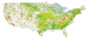


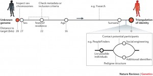


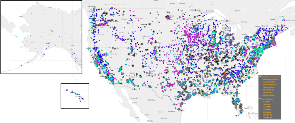
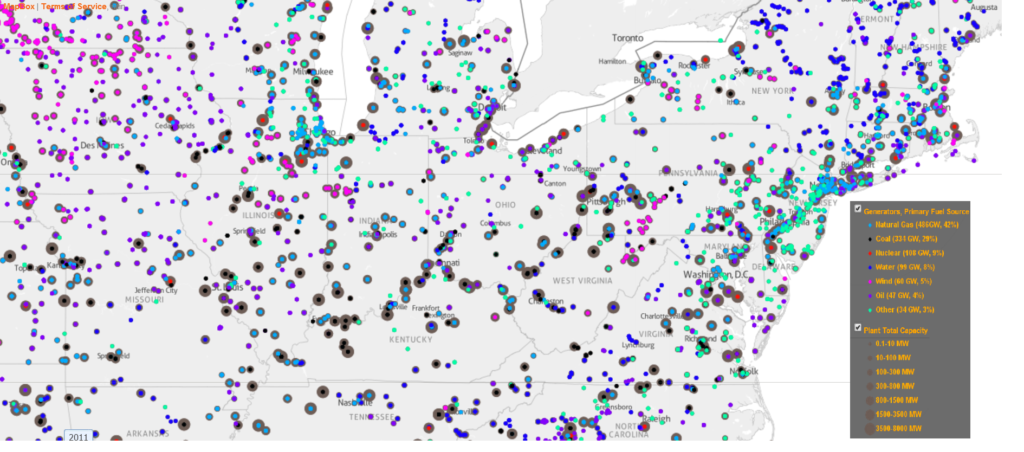
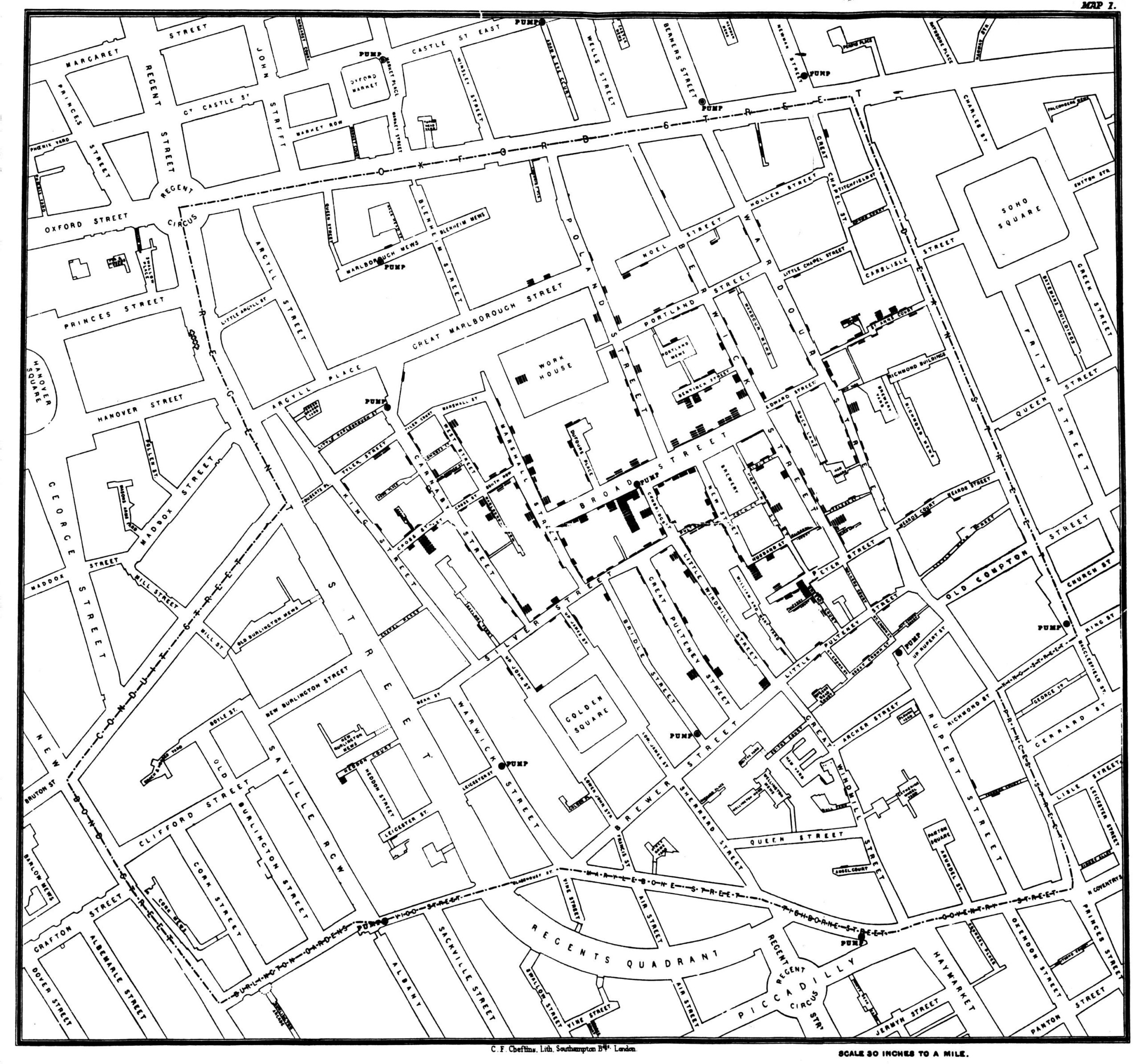

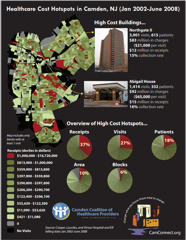

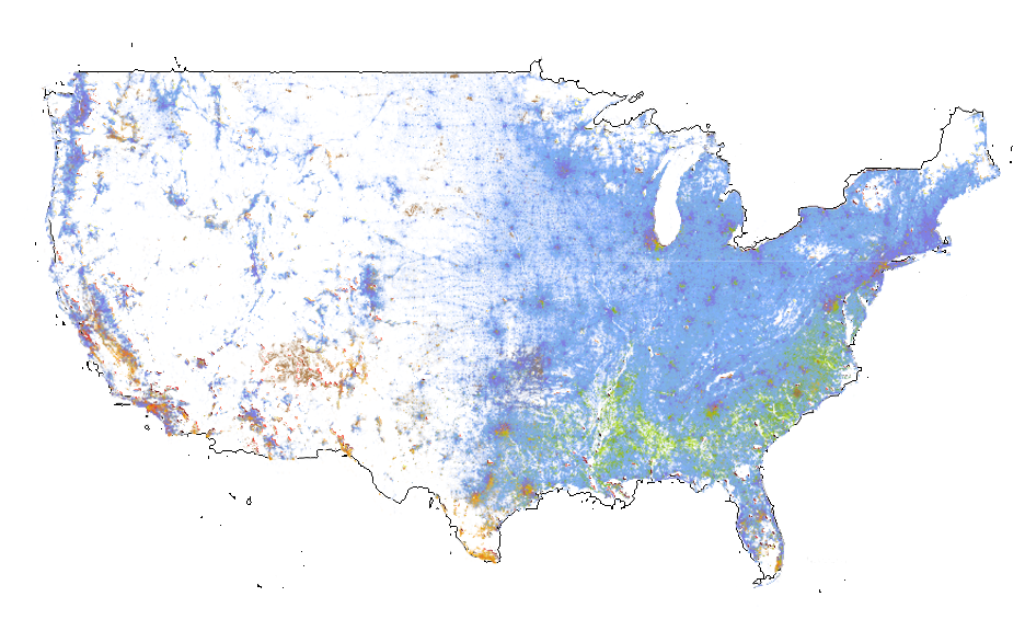

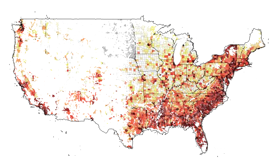