Data Disobedience
Recently I attended a protest against the Bakken Pipeline, which is being built a few miles from where I live. About 30 people, including a couple of my friends, were arrested at the protest. Though I carried similar sentiments about the pipeline, I was only beginning to learn about the issue, and I wasn’t exactly committed to being arrested. And in learning about the issue, as with many things, I found it difficult that there wasn’t a clear map of where this is all going on. And of course there was no public mapping data available either, for a public easement that goes across four states.
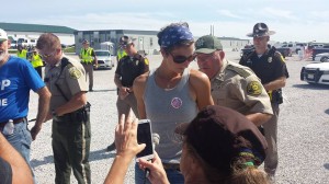
A picture I took of my friend Julia Slocum getting arrested for blocking construction on the Bakken Pipeline in Boone County, Iowa.
Many people including myself have asked for mapping data of the Bakken Pipeline, and have been denied or given hard copy documents. In at least one case, Dakota Access LLC, the pipeline company, asked a state government to not release mapping data for their own security, even though you can see exactly where it is on the map images they give you, and can draw them out if you wanted to.
So I did – I asked each state, and found maps, and found some people (credited here) on upwork.com in the Phillippines and Kenya who spent several dozen hours taking them apart, spreading them over a map (called georeferencing), and drawing over it. So there is my act of civil disobedience, sort of. And here it is – a map of the Bakken Pipeline, that shows the precise location of the pipeline and allows you to locate your current position, shows the current construction progress, properties it crosses and taken by eminent domain, and the property owners in a lawsuit with Dakota. Soon there will be additional information like the location of camps and protests and events. The map is embedded below, but it is also available as a separate site that you can use on your smartphone, and also see where you’re located: https://bakkenpipelinemap.com/
A Data Call to Arms
This is a part of a much larger problem – in the United States there are hundreds of thousands of miles of pipelines and power lines that are prevented from being mapped. This is deemed “critical infrastructure” that needs to be protected for security reasons. Usually this is misleading, and often it is bizarre. I once asked the Army Corps for a location of all the dams in the US, and they denied the request, even though you can see each of 90,000 dams in this country clearly on Google Maps, and can actually view them all on its website.
The censorship of “secure” public data like this is like anything that becomes sort of moot with the internet, or can be if you took the effort. You can still generate a map if you take the effort to do so, and this would be a great effort to crowdsource. It’s as hard to understand energy without a map as it is to understand how to navigate without a road map. And speaking of security – it would be good for people to know the location of the 90,000 dams that choke nearly every river in this country, and the pipelines that are critical to water and soil everywhere, which is the most basic source of security there is. And centralization leads to more centralization and insecurity – if we cannot have a national map of our power grid, maybe the problem is that we need to have a more decentralized, resilient power grid, that is in the end more secure.
People should do this for all our censored public energy data – in the same way people have come together and mapped crises, it would be great if there was a collective effort to map all the pipelines and power lines across the US and the world. Like people in the humanitarian openstreetmap community came together to map Haiti after the earthquake, shown in the video below, groups should map pipelines as they are being proposed or constructed, and track their progress.
Mapping Power through Energy
In the long run, all of the world’s energy production and history should be mapped. It will explain a lot, from the history of why lines were drawn the way they were in the Middle East, to the geography of defense, power, corruption, poverty and the environment. Extractive industries almost as a rule corrupt places and make their power rest on single industries rather than the needs of people. There is hardly a single place where extraction industries like mining exist and the politics are not corrupt. This pipeline is no exception – it was driven through with all sort of political maneuvers on state utilities boards, using eminent domain across hundreds of farms for a private oil pipeline. The more this happens, the more each of these places will be corrupted, every county and state.

Making Energy Come Alive
MapStory.org is currently at the cusp of finishing a major overhaul, and this would be an excellent case of showing a current event unfolding. Digging through documents, it’s hard to know exactly where and when the pipeline was approved in each state, how it was constructed, and so on. Now with the weekly updated maps in Iowa, people will be able to track the progress of the construction, and going further back in history, as the map below shows of mining production in the Bakken Oil Fields. So far only two maps have been done, so not much to animate, but in the coming weeks, it will be tracked. In the long run, I see MapStory.org being location enabled like the one I made, and truly keep track of how things unfold. In the coming months I’ll be generating maps that make infrastructure come alive – imagine a map like the Toronto traffic map below, but of oil, showing where it’s going, exported, imported, and the oil fields being discovered, tapped, and shrunk over decades. That will allow people to see the history of resource extraction more clearly.