Recently while researching for another project, I stumbled across a dataset of all the power plants in the United States – each plant, its coordinates, with each generator, each with all the different fuels they use, their capacity, where they get their water for cooling, and the dates they were installed and when preexisting generators were removed. Of course, I was eager to map it as soon as I could. Check out my first results (in case the embed doesn’t work: http://mapstory.org/maps/1665/#full):
An explanation of this Mapstory
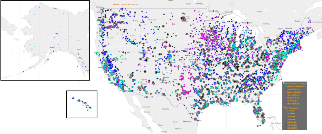
To make this mapstory, I had to do some processing, adding up the expansion of capacity over time with the addition of new generators. Keep in mind that, as with almost all datasets you find, it is only of existing power plants. The data does however have preexisting generators in existing plants (which I did not include in the mapstory), but I don’t know how much that data covers the further back it goes. Also keep in mind that a given generator can burn many different fuels (according to the tables), and many may switch their fuel types. I just assumed that the fuel type listed in the first column was the primary fuel source, I may be incorrect. Lastly, as there are often multiple generators, and there is one set of coordinates for each, the generators for plants are on top of one another, and there is only one dot shown for each location that can be seen at a given time, showing the fuel type of only one generator (I suppose I could make sure that the majority of the capacity was a certain type, or has “multiple” when it is more mixed). In any case, I think that the map would approximate the fuel types overall. The capacity is also by “nameplate capacity”, whatever that means – the data has summer and winter capacity as well, which I observed is usually not tremendously far off from the nameplate capacity. So as often the most accurate title of the layers is lengthy: one has “All existing power plants in the United States, with existing generators, by nameplate capacity, 2012” and “All existing power plants in the United States by the first fuel type of one visible generator, in 2012.”
The Story this Tells
Watching the layer of existing plants expand capacity is probably pretty accurate; watching the layer for the fuel types is only somewhat – as I mentioned, they switched fuel types. One of the power plants in the town I live in (Ames, Iowa), is soon going to make a historic switch from coal to natural gas. I’m guessing that coal, natural gas and oil and some of the ones labele “other” are interchangeable, and nuclear and water powered generators are not, so the latter would be accurate. As for the fact that there were probably plenty of power plants that were decommissioned, I’m guessing that the early coal and oil ones are are rarely still around. I suppose the mapstory tells a story of how long various power systems have lasted, especially in relation to water – the earliest plants appear in 1891 and until the 1950s, the existing generators are almost completely dominated by water power. The capacity of plants was also lower until then, which was probably the case even though prexisting generators are not seen – you can see the circles expanding drastically starting in the 1950s. Nuclear comes into existence more in the 1970s, partly with the onset of the energy crisis back then. As of 2012, the latest year of the data, there were 6,548 power plants with about 19,000 generators. Of all the plants, 2,448 had only one generator, 1,339 had two generators, 955 had three, and so on – the most generators of a single plant is the Edison Sault power plant, one of the oldest power plants, which has 73 generators of 600-860kw for which replacement parts are machined on site. The range of capacities is huge – this goes from 0.1 MW up through the largest at 6-8000 MW, like Grand Coulee Dam. Power plants have become enormous since the 1950s. The Three Gorges Dam in China is the largest dam in the world, and supplies 22,500 MW, which I would guess was maybe a fourth of the electricity used in the US before World War II. It’s also interesting to see the geographic patterns – as can be seen in the maps I produced below, you can see the “wind belt” concentrations from Texas through southern Minnesota; there also appears to be a “coal belt” that I wasn’t aware of, which goes along Appalachia in an arc south through Texas and is also heavily clustered in parts of the Midwest and the vicinity of Wyoming; water would not surprisingly be clustered, and the rest are pretty mixed (especially the ones that may be overlapping).
*of one generator
(CC-BY, Nitin Gadia)
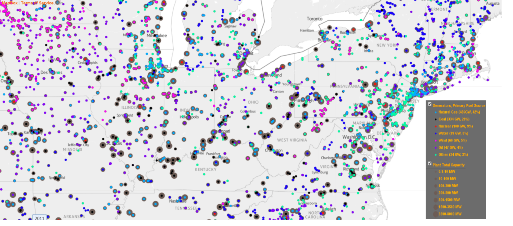
(CC-BY, Nitin Gadia)
MapStory Energy
The data is by the US Energy Information Administration (EIA), and is from 2012 – they appear to have data you can download going back to 2001, though it appears that they might have the same datasets going back to 1990 that may not be digitized. So for at least the last 10 years, someone could pretty easily generate a complete picture. However, going back further will require digging through all sorts of records, and perhaps added by MapStory Local enthusiasts, if there aren’t lists to be found. It would be interesting to find information about Ames’ early power plants. The generators came into existence in the 1970s, and we surely had power well before then. According to my mapstory on Ames, the first “light plant” was in 1896, I’m guessing was probably powered by coal. Seeing how coal was the largest fuel source for all energy use until the 1950s, I’m guessing that they’re all gone. This is of course laying a seed for more work to be done – eventually it would be good to see all the power plants in history, everywhere. And this should only be a part of what will probably be called something like “MapStory Energy” – we should be able to see all energy infrastructure, production and consumption – power plants, transmission lines, raw materials, coal mines, oil pipelines, traffic volume, industrial production and use, how much is being used and for what purpose going where based on the thickness of lines, and so on. One thing in this dataset that can be mapped is the volume and source of water used for cooling generators – something like 10% of the water use in the US is for this purpose, and in many cases with once-through cooling systems, it is making parts of rivers and lakes death traps for massive numbers of fish. This can go a long way in understanding energy – one thing that is of particular interest to me is showing the increasing – and hopefully eventually decreasing centralization of energy over time. I don’t really care for centralized power; scale and efficiency is not everything – individuals and communities need control (see a crappy early animation I made of the subject here). It would be great to see how oil was used and affected the divisions and politics of places, especially the Middle East and its vicinity (such as this amazing map I saw recently). We can even show perhaps 3D mapstories of every reservoir and every well and how much oil was being drawn from it, and where it was going. Solar is taking off – global capacity has actually been consistently doubling every 2 years for 20-40 years. Of course, it would be difficult to track – but I would think that with satellites and given the fact that solar panels must not be shaded, we could track how many are appearing on roofs, and perhaps some way to determine how much energy they are putting out. More to come on MapStory Energy some other day.
See also:
*Overall electric consumption, by fuel type 1950-2010
*Overall per capita energy use, US, 1650-2010
*Electric consumption per capita, US 1960-present
*Nice mapstories by the EIA
Leave a Reply